Neilson’s Branding
Junior Year: Fall
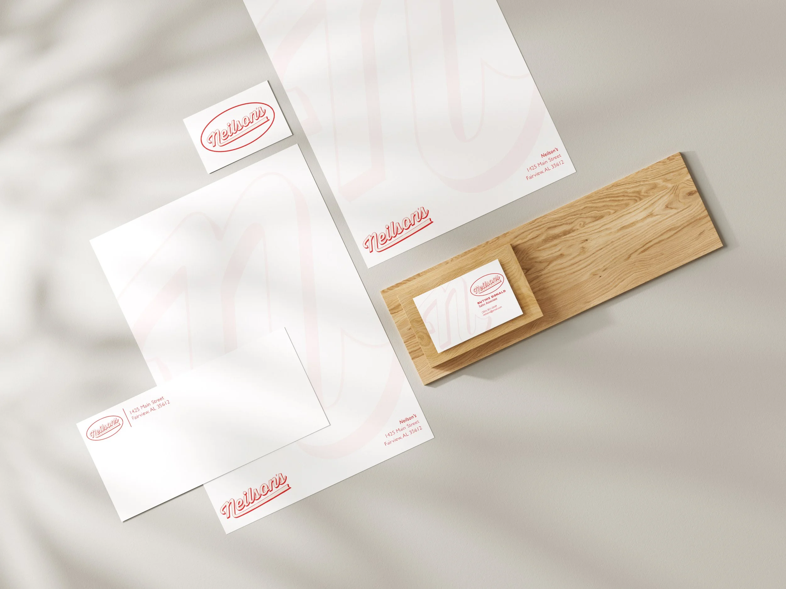
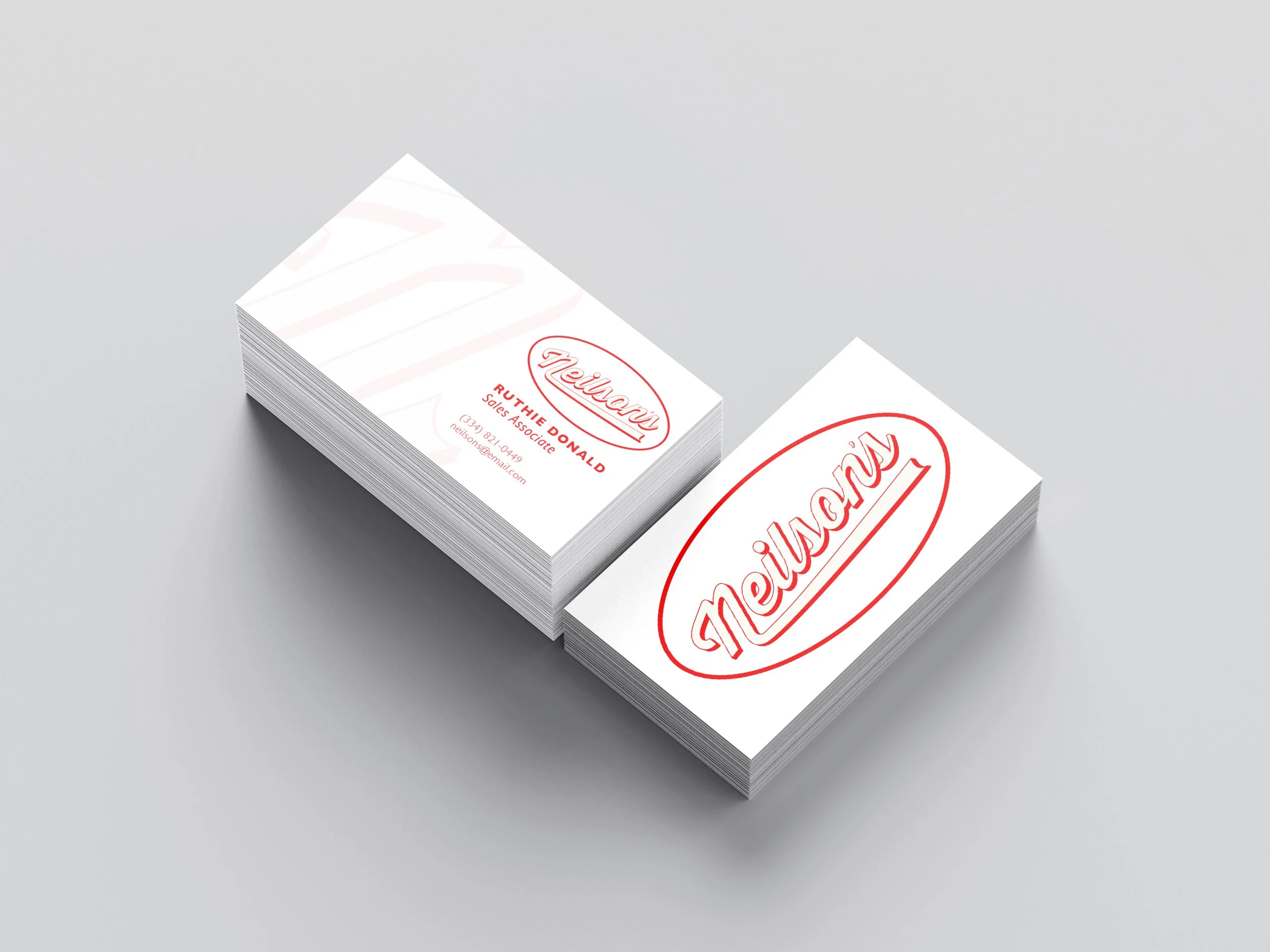
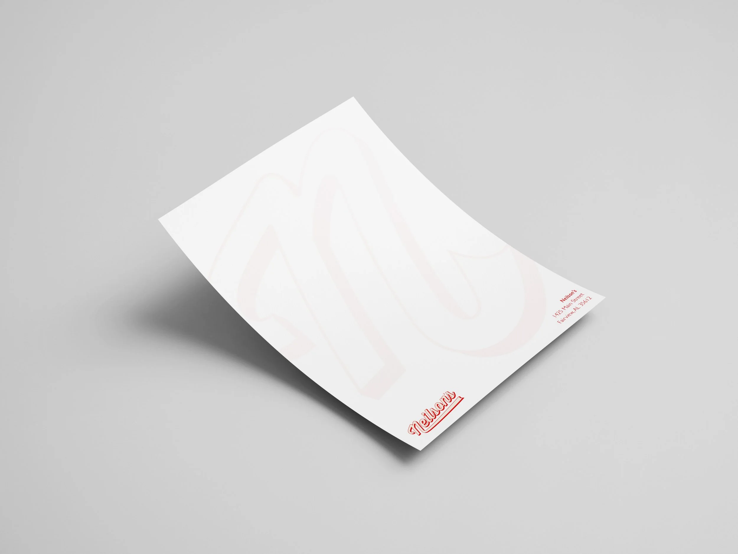
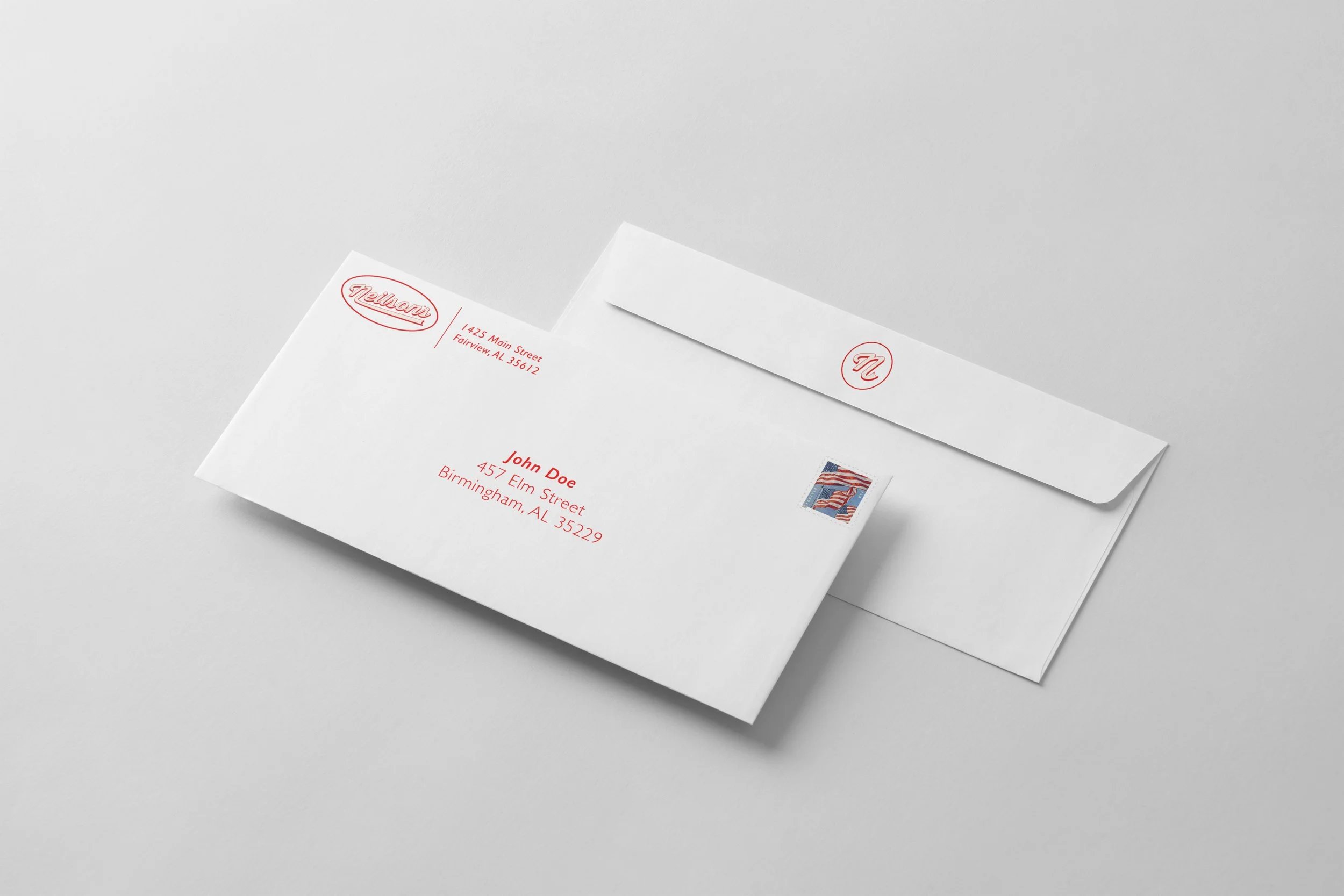
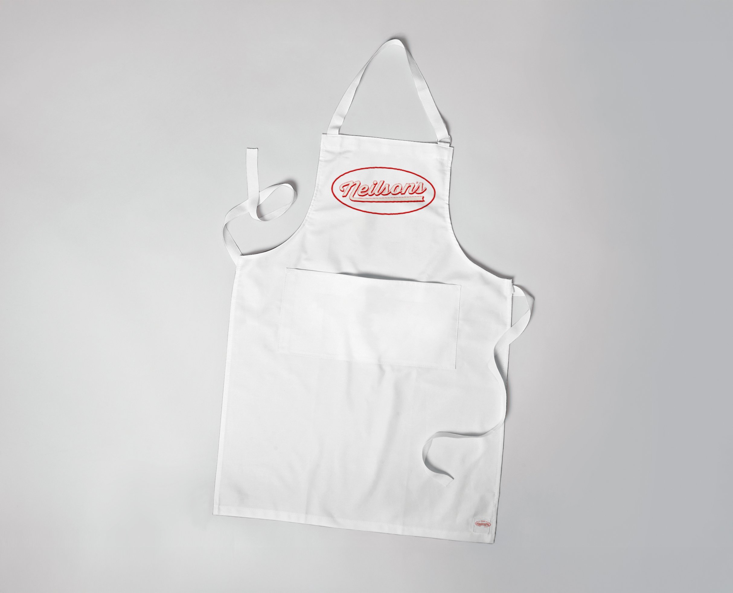
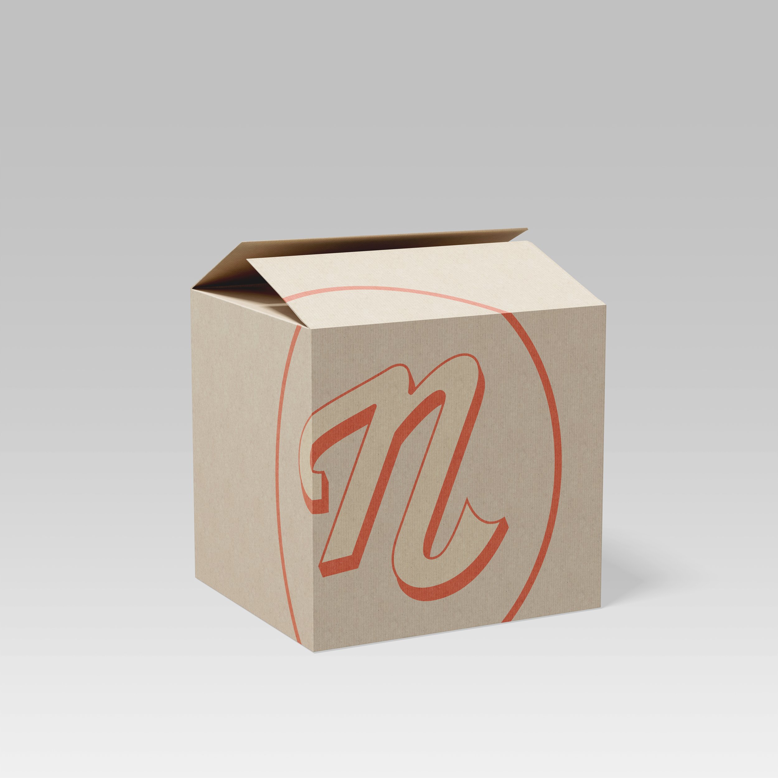
For this project, we moved beyond creating a single logo and begin exploring logo variations and brand applications. This includes considering how the logo will be used across different contexts, such as signage, packaging, digital platforms, and promotional materials. Developing consistent brand standards and flexible logo options will be essential to creating a cohesive and professional visual identity for the hardware store.
Neilson’s is a neighborhood hardware store dedicated to serving DIY enthusiasts and local contractors. They take pride in offering personalized service, expert advice, and a carefully curated inventory designed to meet the needs of their community. From tools and paint to seasonal garden supplies, the store focuses on helping customers complete their projects successfully.
Primary Logo
Primary Icon Mark
Bento Board